One of the most important marketing ploys for a film is having an eye-catching poster that will draw in punters and get bums on seats. Most film posters, will simply grab your attention, no matter how good or bad, but have you ever truly seen a shocking film poster? Take a look at these sad excuses of adverting!
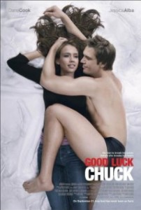
1) Good Luck Chuck
Guys seriously? This has to win as one of the worst digitally altered poster in film history. Jessica Alba appears to be levitating off the bed and looks a lot smaller than she really is and Dane Cook…well. I know the chap is tall but I don’t think he has 6ft worth of leg! I can see what they were trying to do (ish) as the story of Good Luck Chuck involves a curse in which if a woman with him once the next person they meet will be their true love, but is this really the way to show it Lionsgate? They could have done so much better.
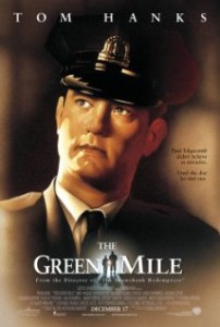
2) The Green Mile
A great film I know, but just look at this poster. Perhaps they got confused with which character Tom Hanks was actually playing, Paul Edgecombe or Woody the child’s doll? What’s with the polished sheen over his face? I’m sure Steven King’s original didn’t have ventriloquist dolls in it. This poster also fails to tell us anything about the film, even though there is a tag line and generally doesn’t sell the film the way it should.
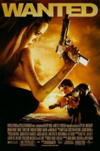
3) Wanted
One word – arm. This arm could not even hold up a pillow, never mind a big arse gun like that! Photoshop at its worst. James McAvoy in the background trying to look menacing with two guns, yet still looks quite adorable – Need I say more?
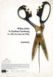
4) Anti-Christ
Lars Von Trier is known for his challenging and unique filmmaking but it’s hard to see how the poster fits for this one. There are plenty of ‘out-there’ scenes in Anti-Christ that would have worked brilliantly for a poster so why go and digitally produce a pair of scissors with the lead actors faces on them on? Just plain silly. And the blood between the scissors gives us an insight of what is to come in this rather disturbing narrative, yet is quite unsettling here.
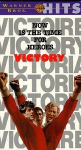
5) Victory
Looks like this list is focusing on arms! Why does everyone only have one arm here? The whole poster is darn right strange. It looks like they all share the same waistline and what is going on with the strange a hand-drawn effect? Not sure what they were trying to achieve here but it is truly awful. Also just in case you didn’t get it by the large text in the background, the film is titled Victory, thanks guys I wasn’t sure on that one!
Let us know what you think and which film posters just didn’t cut it in the section below!


