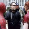
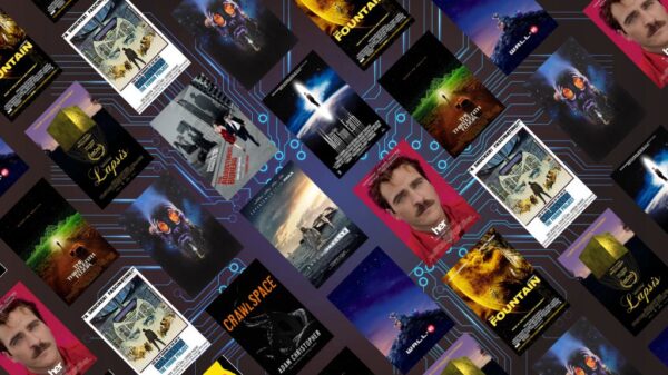


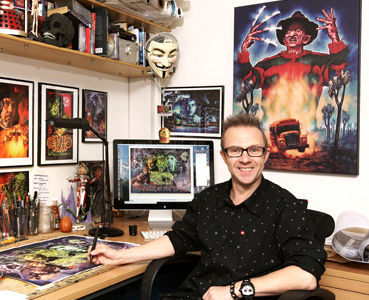
Graphic designer and artist Graham Humphreys has a hugely successful career that has spanned the best part of 25 years. His credits include designing posters for Evil Dead, Oldboy, House of 1000 Corpses, From Dusk Till Dawn and countless others.
With a recent design for The Town That Dreaded Sundown and a book called “Drawing Blood” on the horizon, CinemaChords thought it would be a great time to catch up with Graham and discuss his past and present.
In this interview we chat about his time at college, the state of the horror industry, our mutual love for The Babadook and, surprisingly, Justin Bieber.
When did you discover you had a talent for illustration?
When I was about 3 years old. Literally when I was picking up a pencil and a crayon for the first time and I started drawing.
I’ve always wished I could draw, but it was something that I forced upon myself, but with you it just came naturally!
I guess if you start when you’re 3 years old, by the time you get to my age you’ve probably developed a kind of technique. I think going to art college was definitely an important factor in what I do. You get to hone those skills and learn the very simple, basic techniques of drawing which you wouldn’t learn otherwise. Getting to learn the laws of perspective, do some life drawing and actually begin to realise how the body is put together. In the first year at art college I just learnt so much and it seemed that everything I had attempted before was nothing at all.
Did a teacher or other student impact you while you were at college?
I went to Salisbury College of Art and it had a pretty good reputation, particularly in the graphic design department which is where I studied. Certainly I can name a couple of guys there; someone who I didn’t get on particularly well with, but I realise with hindsight that they were quite a big force in shaping what I do and that’s Rupert Ashbourne. We had visiting lecturers; Mike Litherland and a chap called Johnny, who’s surname I can’t remember! There were various characters who were part-time lecturers who were actually working as actual illustrators and just visiting to impart their real-life experience. This was important because it gave you a sense that the work you were trying to do did have some basis in the real world, not just the bizarre fantasy world of the art college.
Did you find it easy to get your first paid gig after college, or was there a bit of a struggle?
It was a lot of struggle! It was very, very hard. I’ve never used any of the social services or the dole, for me I thought it was essential that I had to try and stand on my own two feet. There were some lucky circumstances, for instance when I first moved to London and tried to look for work, I was able to share a bedsit with three other people I’d been to college with. I just dropped in there and slept on the floor for a good year or so. My rent was £9 a month, as it were in 1980, but I struggled to pay that *laughs*. Everything seemed a lot cheaper than it was and it was a lot easier to live then, than it would be now. So, I was lucky in that respect. We moved to a place in West Hampstead and there were 5 of us sharing. It had been traditionally student education and there must have been a history of reprobates in there. We did find used syringes in the kitchen when we moved in. We did find out that that area had been popular with people in the music business. We used to go The Railway Tavern which had a basement called The Moonlight Club, which was a bit of hang out for rock ‘n’ roll types, like ex-Sex Pistols hung around at the bar. We saw Nick Cave and his early band The Birthday Party perform there and Joy Division played there about a week before we moved in, so we missed out on that one! It was quite an interesting area; there was a lot of energy there and it definitely fed in to the work to an extent.
You have illustrated for both the film and music industry. How did the two differ?
For me, the two are one and the same in many ways. They’re both a form of entertainment and have transgressive faces, as well. When I was first looking for work I went to the music press, record companies and film companies. The work started to pick up from both areas simultaneously and the stuff I’d been doing in NME in the early days, had been noticed by a few people in the independent film industry and vice versa. I got to meet Brian James, The Damned and a punk super-group. That was an interesting mix and they were in to film as well, particularly horror films so all these things played very much together.
What was it that attracted you to the horror genre specifically?
I also understood that there was a transgressive edge to horror and at its best, horror actually attempts to address political issues, sexuality and troublesome areas of psychology. It’s a great metaphor for a great many things. Without knowing this, at the back of my mind I understood that it was going on. If you look at the Hammer stuff – the era that I love the most, with all those films there is always an area of sexuality, tension and repressed feelings. It’s all these things that people don’t like to talk about. Certainly in the Victorian times, which you could argue, is probably the home of Goth in many ways. It’s all about repression and how people deal with it. You can deal with it in a metaphorical way, like in Mary Shelley’s Frankenstein and Bram Stoker’s Dracula; all these great classics do tackle these themes in a subliminal kind of way. It’s interesting to look back at these books and pick through those bones and see all the little themes within them.
My university dissertation focused on supernatural horror and I found it fascinating learning about psychology, gender representation and sexuality in those films.
It certainly is. If you go through different eras of horror, like in the ’50s you get this sensation of the Cold War and nuclear panic films. The idea that there were ‘others’ out there to get us and whether they were Communists or from elsewhere, you do get a sense that there are other forces out there trying to attack us. Those themes are quite apparent. If you move in to the ’60s and then we get the Hammer stuff, which is all about sexual liberation. In the post-70s we get post-Vietnam commentary, especially from America, which is about people coming back from the war who have encountered real life horror; how they will deal with these inner demons and their split personalities. At its best, horror addresses things that are going on around the world.
What do you think of the state of horror at the moment? For example, the recent It Follows is a major throwback to the ‘80s, do you think this is going to start a new trend in horror?
It most certainly could. The barometer I always use is Frightfest in London where you get to see the whole spectrum of new horror. Some years are quite poor and you think it’s becoming quite a dying genre, but then last year was probably one of the strongest years I’ve ever seen with some amazing stuff from New Zealand and Australia. A lot of foreign language stuff is really interesting and transgressing in a way that American cinema doesn’t seem to be able to do any more. Even in UK cinema there is a money-making mechanism and you get to the point where there’s all these endless franchises, remakes and re-imaginings. You get the feeling that there isn’t anything new out there and something like The Babadook or It Follows will pop up, some really interesting films that have come out of nowhere and you think, “blimey, it’s still a vital and fresh genre”. It’s great to see it keep changing and mutating. Obviously, people are influenced by things that they’ve seen as kids and the nod to the ‘80s can be seen in many, like The Guest. It is very much a nod to the 1980’s aesthetic, like It Follows. Maybe people are trying to improve on things they saw as kids and that’s always been the case. Hammer films were a nod to the Universal monster films and Universal films were a nod to the literature at the time. The 80s is bound to influence the people of the 00’s and this will continue to happen. As long as there are fresh ideas, people will continue to be inspired. There will always be room for a re-working of Dracula and Frankenstein, but it’s good to see we live in a world where horror is unfolding around us and it’s important we address this in the best possible way. If it means we have to disguise the discussion in a metaphor, at least it’s out there and there will be people who understand what’s being said. It’s a good way for communicating indirectly.
There’s always room for creativity and it’s a shame that not as many film-makers go with their heart, rather than a possible monetary reward.
Absolutely, I agree with you. You can really can tell when you see a film and that film-maker, director, writer has actually put themselves in to that film. There is something of an actual person there, as opposed to a cipher or a cliché. You know I just cannot bear the idea of another Avengers film or a Fast and Furious, Superman or Batman..can you just stop, please?!
Superheroes are endless, they’re going to be around for the rest of our lives.
Please, don’t say that! *laughs*

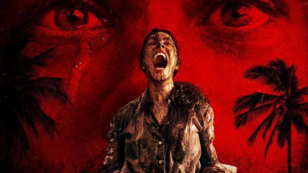
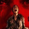
It’s true! Thinking about creativity and posters.. A lot of those are quite similar to each other and there’s countless articles pointing this out. But, with your poster for The Town That Dreaded Sundown, it’s another throwback to the past and its distinctive style. Was this the aim with your design?
It’s interesting, because I had seen the film at a screening and I wasn’t initially that enamoured by it, to be quite honest. But, I did have a lot of red wine that evening, so maybe that wasn’t the best way to see the film! It’s an interesting way of moving on from the first film, which in itself references a previous era as well. The new film, again, references the old film, which in itself is referencing a previous era. It’s quite interesting how it jumps in 3 different places like a bizarre, post-modern take on horror. It’s interesting how the first film has a lot of humour in it, and almost plays as a comedy. The new one, however, does not. The new one seems to weed out the comical elements and just present the more obvious horror directions. One of the ideas that came about when I was commissioned to do the poster was that it should encapsulate the original 1946 era and eras of the new film. The styling is trying to look very ‘40s, but it references a lot from the original film.
Did you see the posters designed by Julian Knez? He created old-school VHS covers for modern films and TV shows.
Here, I’ll send you the link. What do you think?
It’s funny, because I grew up in that era of dodgy VHS covers and they look finely authentic. *laughs* There was so much stuff being thrown out at that time and a lot of the covers were quite crude and actually done in-house, as well. As you can see, there would always be some kind of border device and you’d just throw in your still and a title. These are of course, photographic images but if you look at the work of Tom Hodge, his work references the ‘80s VHS era, but it’s all illustration work. It’s digital, but it has that authentic, cheese factor; big guns, big breasts..everything had to be big! It’s real hard-sell imagery. Whether it’s a good or a bad thing, who knows? It certainly had a lot of iconography that resonates for a lot of people. You could say that the film packaging from the 1980’s era has almost become the film content of the re-imaginings.
Is there a recent poster that’s really impressed you, or made you wish you’d designed it
Hmm, I can’t really think of anything..
So, that’s a no then?
*Laughs* Every now and again you’ll see a poster and you’ll think, “they really have gone out on a limb there,” where they’ve tried to do something which is not, as I like to call them, Moonpig posters. I just get sick of seeing them! Essentially, they look like they’ve been done on the internet, like a greeting’s card poster, you know? You’ve got a bunch of heads in a frame and your standard title treatment. They just look so generic and it’s quite depressing to see. You don’t know whether you’re looking at a poster for a film or an ad for insurance or an ad for underwear. We have ads for underwear that try to look like film posters and the messages are really mixed. It just boils down to a pretty boy and a pretty girl and it’s pretty bland.
I think you can get some pretty good fan-designed posters, which are better than the official ones used for marketing.
I agree. It’s people who actually understand the integrity of the film and its visual richness. I think most contemporary posters are concerned with making their stars look as good as possible and they’re missing out on the whole content. And you think, “What are you actually selling here?” You get the sense that they’re just trying to sell the stars and you just wonder what the film is about. There are a lot of posters with just 5 people in a line and they’re being very coy about what’s in the background, so as not to take any attention away from the stars, the talent, in the foreground. There’s actually nothing of the film there! Illustration is always a good way of getting over that. You’ll always want to enhance the face; make a man look more rugged or a woman more curvy, all these clichés, but at least it’s an attempt at defining what these people are. It’s not just “Here’s Tom Cruise” or “Here’s Christian Bale”.
One of your most famous posters was for Evil Dead and you’re credited with contributing to the film’s success. You were only 20 years old, how did that make you feel?
It was a case of being in the right place at the right time. It was all about luck, at the end of the day. I’ve recently been in touch with Sam Raimi and he’s quite forthright about the same thing. He believes that the marketing was a very, very important part of the film. Certainly the way that Evil Dead was successful in the UK, has been down to the way it was marketing. It was a pursuit of Palace Pictures to not go with the photographic routes and to actually go out on a limb. I think the film would have done well anyway, there’s no doubt about it. It was not intentional on my part, but the poster did look very different to everything else at that time. That was partly down to me not being very technically skilled at the time and probably thinking it was a bit of a b-movie and wouldn’t go anywhere. There wasn’t this urgent need for it to look very commercial anyway and that kind of became its strength. It was an unappealing poster in many ways. *laughs* The colours were non-traditional and it was a bit of a slap in the face. So, it was just a lucky series of coincidences which made it successful and I can’t take credit for that.
I think you’re probably being a bit modest, but I’ll let you off. Are you usually given free-reign on your designs or are you briefed beforehand about what they’re after?
It does vary, but largely people trust me to draw out bits of the film that are relevant and present the most visual, enticing formation. On rare occasions, people will say, “We want to concentrate on this scene or have this character really prominent” and you listen to that and do what you can with their brief. Generally, people do trust me to make those decisions, but I do ask if there is anything that they really want me to concentrate on. Usually I’m just told to look at the film and see what I think. I do up to 7 differentiations of the same sketches which they can pick and choose from. It is a bit of a team effort sometimes.
Is there a piece of your work that you are particularly proud of?
There are 2 or 3 pieces that I am quite happy about, but I’m not particularly proud of any of them specifically. For me, the best work is yet to come because I’m learning every day and on every job I do. One I did recently was for What We Do In The Shadows and it’s basically just a portraiture, but there’s something about it. I also did a poster for a Hammer event and it encapsulates all the best bits of Hammer; Christopher Lee, Peter Cushing, a plague of zombies and all these great moments from Hammer at their absolute best.
The posters you’ve done for Korean films like Oldboy and Lady Vengeance have a very different style to your others, was there a reason for this?
Largely it was down to material being supplied already and they were mostly adapted from existing campaigns. For instance when I worked on Oldboy, there were a couple of existing shots from the film that we played around with. I know that my brief at the time was to make it quite operatic. There were 1 or 2 films where I had to come up with something completely new, like Dead or Alive, Dead or Alive 2 and 3. This was pre-DVD, so I don’t think I’d even seen the films at this point. I had no idea what was going on in the films, but I thought “this shot looks good..this looks good..” but I had no idea how relevant it may or may not have been. The clients seemed happy, though!
I think I prefer the poster to Lady Vengeance more than the film itself.
Oh, fabulous! A great poster can be better than a film, there’s no doubt about it. I was influenced by many posters of films from the past and I hadn’t even seen the films. Somehow the poster was sufficient and made me feel like I’d seen the film, so why bother to go and see it? *laughs* You know that the film will never live up to the poster!
Maybe that’s why some films don’t want to have decent posters…
Yeah, put the stars on it, so if the film fails it’s their fault! Damn Tom Cruise, he just ruined another film! You may have read that for Edge of Tomorrow in Japan they had to change the campaign completely because they didn’t like Tom Cruise. So they removed him from all the film’s imagery to sell the film.
But he’d still be in the film when they see it! They’d feel tricked.
*laughs* Yeah! Duped again, dammit!
Is there any of work that you’d lke to go back to and change?
Oh yes, probably everything I’ve done! It’s interesting you should say that, because there have been a couple of posters I’ve done of late that are re-workings of things I’ve done in the past. I’ve repainted the Evil Dead and Evil Dead 2 for a client and I did a re-working of the Return of the Living Dead. There have been about half a dozen I’ve revisited at the request of clients. It’s interesting, with the tools you have now, going back to an old job and realising what you couldn’t do at the time and you can do now. I’ve tried to retain the integrity of the original job, not wanting to take away whatever made that original piece memorable for people. It’s been an interesting experience trying to do that.
Is there a particular band or artist that you’d like to do a design for?
To be quite honest, I think I’m a bit too old to be looking at newer acts, so I still have my favourite bands. There are recent acts that reference older acts and there is an element of homage in music, anyway. I always say that I’m quite open to working with anybody. I’ve been recently working with a heavy metal band in Italy, so anybody who wants to come to me for the imagery I’ll work with them. I won’t say that there is any specific artist I want to work with, though. There are a lot of artists that I wouldn’t want to work with, however. *laughs*
What if someone like Justin Bieber approached you?
I’d do it! I know that if they came to me, then they would do so knowing the work. It would be my chance to reinvent them completely and they would have to be open to that. Poor old Justin would get to the point where he’d be thinking, “this isn’t working anymore and everybody hates me, let’s just go the whole hog and make me a complete bastard!
I think if Justin Bieber reinvented himself and became Metal Justin Bieber, it would be much better.
He’s obviously inclined to be a bit of a naughty boy, so the squeaky clean image is probably exhausted for him now. It’s interesting to see people reinvent themselves. Famously, Kylie Minogue tried to reinvent herself as an indie act when she collaborated with Nick Cave, and it was of course, a terrible failure. She went back to the disco style that she knows so well. Reinventing yourself isn’t always a good idea, but if there’s nothing else left for you then that’s what you’ve got to do. But yeah, I’ll await Justin’s call.
I’m going to make this happen, I don’t know how. I’ll get to him on Twitter and hopefully he’ll reply.
It’ll make the world a better place!

You’ve got a book coming out in October, can you tell us a bit about that?
I have. It’s called Drawing Blood and it’s a title that I think people generally like and I find quite funny. It’s a terrible pun and I quite like it for that reason. It comes from Al Murray, if you can believe? I went to see him live about 10 years ago and I sat, stupidly, at the front of the audience. I had bright red hair, so I was obviously going to be picked on. He did come to me and I told him that I designed film posters and he seemed quite interested, but moved on. But, he kept coming back and said, “he’s sitting there drawing blood” and it stayed with me, so I thought, “that’s what I shall call the book!” It’s a collection of the work I’ve been doing for 25 years. It begins with Evil Dead and finishes with a piece I’ve not yet done. There will be new pieces in there, so it will be as up-to-date as it can possibly be. I’ve got 120 images that I’m going to put in there and make sure that someone’s written a piece to go with it. There will be text contributions from Sam Raimi, Mark Gatiss, Brian James from The Damned and Kim Newman; the usual suspects. I wanted there to be an amount of context applied to the images as well. I’m hoping that it’ll be quite an enticing little collection, but the main point is for it to be an inspiration for other people as well.
I’m sure it will be. It must have been nice to revisit some of your work and get a bit nostalgic.
For some of the pieces, but there were a few that I’m a bit embarrassed about. I have a big cupboard of stuff that I was going through last weekend and I pulled out so much stuff that I was like, “That’s definitely not going in!” *laughs*. There’s a lot of work which people will never see, if I have my way. You do stuff because you’re freelance and you have to earn a living, so the horror stuff was just one area of my work and what I do the most. But, there is a lot of other things as well and I’ve done all sorts of embarrassing things. I did work for Mothercare at one point and all these unlikely things. You won’t be seeing those, anyway.
What else are you currently working on?
Most of the stuff you have to be confidential about, because when people have stuff coming out they want to keep it secret. I’m doing some stuff for a German company at the moment; there’s a couple of classic titles coming out. I’m doing some t-shirts for Fright Rags at the moment, I can just say that it’s got Chucky on it but I can’t say for which film. I’m doing something for Lords of the New Church; they’ve found some live footage from a TV show that they’ve been on. It wasn’t aired, because it offended sensibilities of the Catholic country where it was shot, but I’m doing a DVD cover for them. That’s going to have a bit of a Day of the Dead theme, which is nice because the new James Bond film Spectre has a Day of the Dead segment. So, that’s quite timely. I’ve got a list of about 15 jobs and I’m just wondering how the hell I’m going to get through them all. Most I’m not allowed to talk about or I’d have to kill you.
Final question: what’s your favourite scary movie?
There are so many to choose from! Something that really frightened me, which isn’t regarded a particularly scary film, The Green Mile. The botched electrocution scene quite upset me and stayed with me. I haven’t been able to watch the film since, I just found it so disturbing. Other than that, I do remember watching The Thing Without a Face, a cold war panic film. It had these stop-motion brains with spinal cords skedaddling around and I remember that really, really frightened me. It took me about 30 years before I could watch it again, but it does look silly now. It’s interesting how something you’ve seen as a child will stay with you and becomes a phobia. I went to see The Babadook at Fright Fest and that really did frighten me. It’s one of a few films that I’ve since childhood where I put my hands up to my face, because I didn’t want to watch. Yet, I have friends who went to see it and thought it wasn’t scary at all. And I was like, “You don’t like horror films, you should be really terrified!” I like horror films, so I think I’ve seen most that there is to be delivered, but I was genuinely frightened.
It scared me a lot, too and I love horror films.
I think it’s because you know all the techniques and the tropes, but The Babadook side-steps a lot of these earlier territories so you weren’t sure where it was actually going to take you. It felt quite new and fresh for that reason. I thought it was going to show me something that I’ve never seen before, but I can’t say that it did at the end of the day, but I didn’t know that at the time. Perhaps if you don’t understand those horror tropes, it just washes over you. It is quite mysterious how that has worked with people. But I’m glad you had that experience, too.
It’s also got great performances.
It has. I usually hate kids in films, but he worked really well.
It’s been lovely to speak to you and I’ll leave you to enjoy the weekend.
Lovely to speak to you, too.